I am now developing a professional Drupal as it can be, and I like it, I love what I do, but most importantly is that my clients love it too. so I am happy.
In my work I many time needs to implement designs of designer who don't know drupal or web designing.
A web designer is a bit different from any other type of design, you have to understand the web page making and structure. so I wonder if there are some good ground rules, best practice rules for good design or designer.
I expect to implement great designs for my customers, but also make sure it doesn't become a mission-to-moon project, so here are some rules I gathered from a few sites:
- Simple, let's keep it simple
Designing each page to detail creates confusion. Visitors get frustrated when they have to scroll through a cluttered interface to find what they need.
Keep your pages simple and your website will be easier to use.
Design is also a type of communication, in drupal you have a theme, which include frame templates, which means that you can design it from outside to inside, create a general 'look' first, set ground rules for main elements, and then design per each page only the internals
- Good Impression
Good design should create a good feeling. The overall look and feel of your site is the first thing your visitors will notice. so don't forget to look on it from far and even ask visitors about their opinion
- Intuitive Navigation
Sections and pages should be well-organized with a top-down design so visitors can easily browse through the different areas of your site.
Check which pages are first to be browsed and most important for your client, and make sure navigation is fast, intuitive, and simple from desktop and mobile.
- Colors are Important
Color selection can make or break a website. When choosing colors, use a limited palette of four or five colors that don't crash. Make sure the text is easy to read on the background, though you can soften the contrast with colors besides black and white.
If you have the time you can create a few sets and the client will get the option to select between them on integration, good drupal themes can even create a configuration for the client to change color settings when desired.
- Responsive Website
All websites today are being used on desktops, laptops, and mobile devices.
The first design version looks great on the current device resolution, don't stop here, it's the designer's responsibility to understand how the design will look on wider or thinner resolution.
- Animation and Transformers
Websites are no longer static HTML pages. They are dynamic pages that include any type of automation, animation, element transformer, and statuses. A good designer thinks about all input controls animation, but also uses animation and element movement to elevate the site impression needs.
- Content
Sometimes content can be very full of images, movies, other media types, and HTML elements, good practice is also to set some ground rules on how to build the website content and what it should include or not include
- Standard Web Conventions

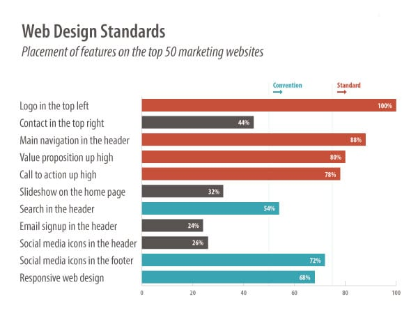
web design standards and best practices, a set of rules the web designer should follow. Here are a few examples
Logo: make a clickable logo in the upper left corner, on every page.
Contact: create a contact button or link in the top right corner of every page.
- Accessibility Standards
Access to information is a basic human right. This has been recognized by the UN Convention on the Rights of Persons with Disabilities. Follow these standards to make your site accessible to everyone.
Reference
- https://sharpened.com/web_design_rules
- https://blog.hubspot.com/blog/tabid/6307/bid/30557/6-guidelines-for-exceptional-website-design-and-usability.aspx
- https://www.smashingmagazine.com/2008/01/10-principles-of-effective-web-design/
- https://www.orbitmedia.com/blog/web-design-standards/
- https://www.w3.org/standards/webdesign/accessibility


